Behind the Artist's Palette
By Belinda Nolan, November, 2023
Marina Abramovic’s Sydney exhibition in 2015, Kaldor Project 30’s Marina Abramovic: In Residence, invited us to sit for an indefinite time before three large squares of primary colours – Red, Yellow and Blue. Sounds simple and yet as I sat in silence, the requirement for all the various, meditative, art practices, I was struck by how each colour had a unique emotional impact. Eight years on, I continue to be intrigued by the power of colour, particularly what compels an artist to choose their colour palette and the implication this has for both the practicing artist and art appreciator.
Picasso’s two distinctive colour periods earlier in his career – ‘The Blue Period’, 1901-04 and ‘The Rose Period’ that briefly followed, from 1905-06, has led art historians to postulate that his ‘Blue Period’, reflected a level of personal melancholy depicted in his lean and haggard figures, who appeared vague and often tormented. This period starkly contrasted with his more animated rose-coloured figures that followed, when Fernande Olivier entered his life, becoming his first romantic muse. This assessment seems plausible, yet to generalize about an artist’s colour choice using the narrow classification that cool colours suggest sadness whilst warm colours joy, appears somewhat restrictive, even reductionist.
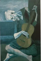
Pablo Picasso, 'The Old Guitarist', 1903-04. The Art institute of Chicago.
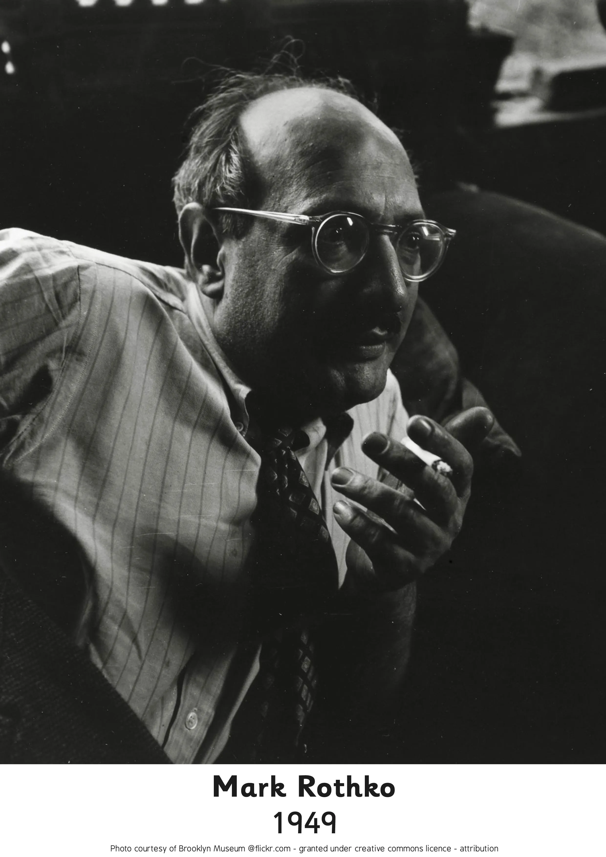
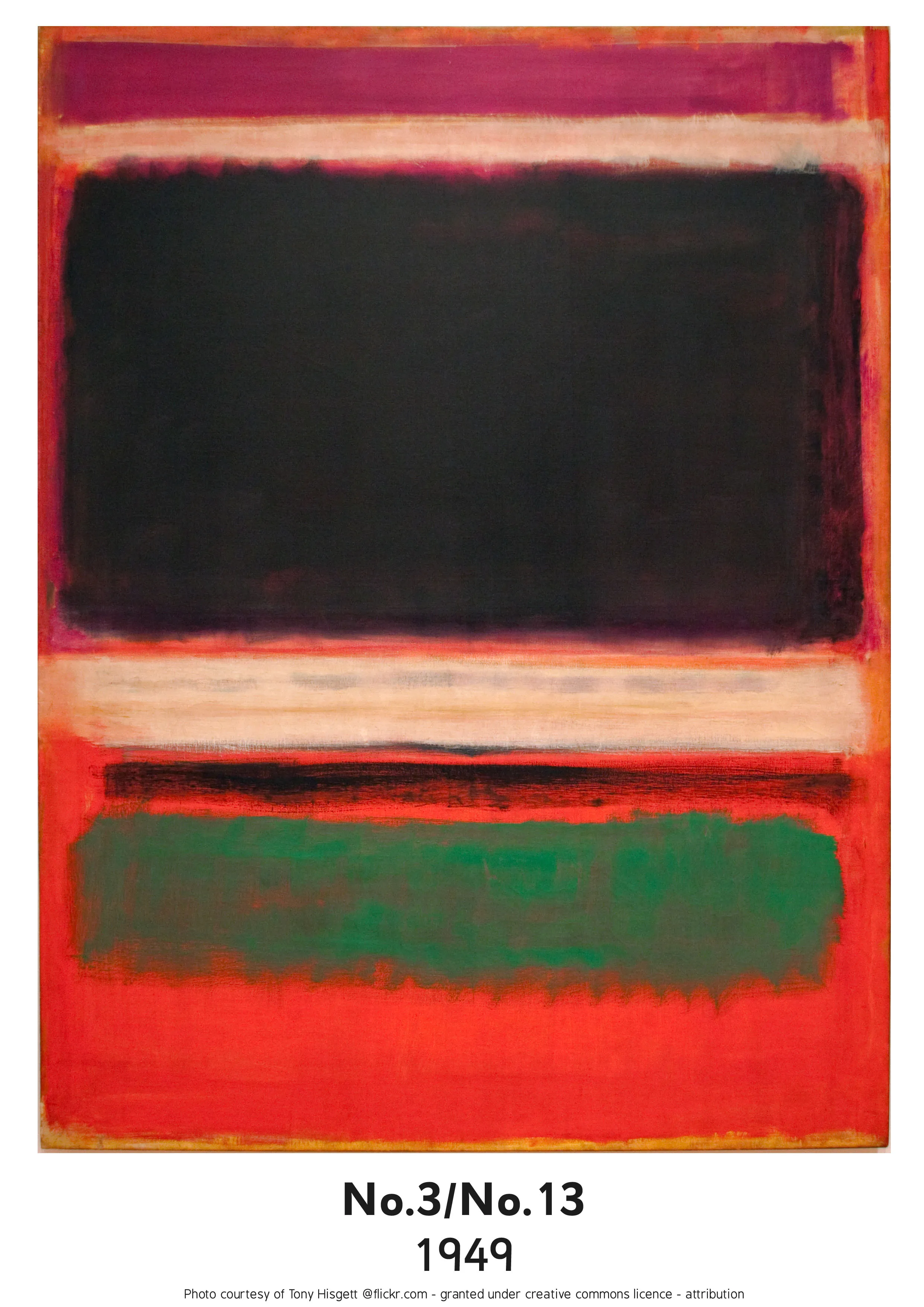
When considering great 20th Century western artists, Mark Rothko is believed to have unlocked ‘the emotional power of colour’, like no other. ‘There is more power in showing little than in showing all’, explained Rothko. This was particularly exemplified in his 1950’s - 60’s artworks, before his death in 1970. His use of large blocks of colour, often juxtaposed for effect, were strengthened using either blurred or straight lines.
When I first stood before a Rothko painting its impact was visceral, not unlike engaging with a Mandala or Yantra from the Eastern Buddhist and Yoga traditions. No longer a mere spectator, the observer and the observed, co-mingled. If asked what makes a great artist, this engagement seems tantamount, for when we can encounter the soul of the artist, such a connection can leave an intangible, though indelible mark.
Rothko ‘said the bright colours sort of stop your vision at the canvas, where dark colours go beyond. And definitely you’re looking at the beyond. You’re looking at the infinite.’
Rothko was commissioned to do a series of paintings for Harvard University in the 1960’s, which he named ‘Scenes from the Easter cycle’. Many art critics have argued that the sombre hues and dark tones depicted the passion of Christ on Good Friday, whilst the warm, vibrant, colour canvases expressed his Resurrection. Rothko would challenge this reductionist interpretation where, warm colours evoke happiness, whilst darker hues, torment. When a woman commissioned him to do a happy painting, Rothko's retort was, ‘Red, yellow, orange – aren’t those the colours of an inferno?’
Alison de Lima who curated ‘Mark Rothko: A Retrospective’ at the Museum of Fine Arts, in Houston, 2015, believes his use of a darker palette was to capture more a ‘contemplative state rather than a nihilistic one.’ In this sense Rothko was inviting us into the dark womb, the void from which all emanates.
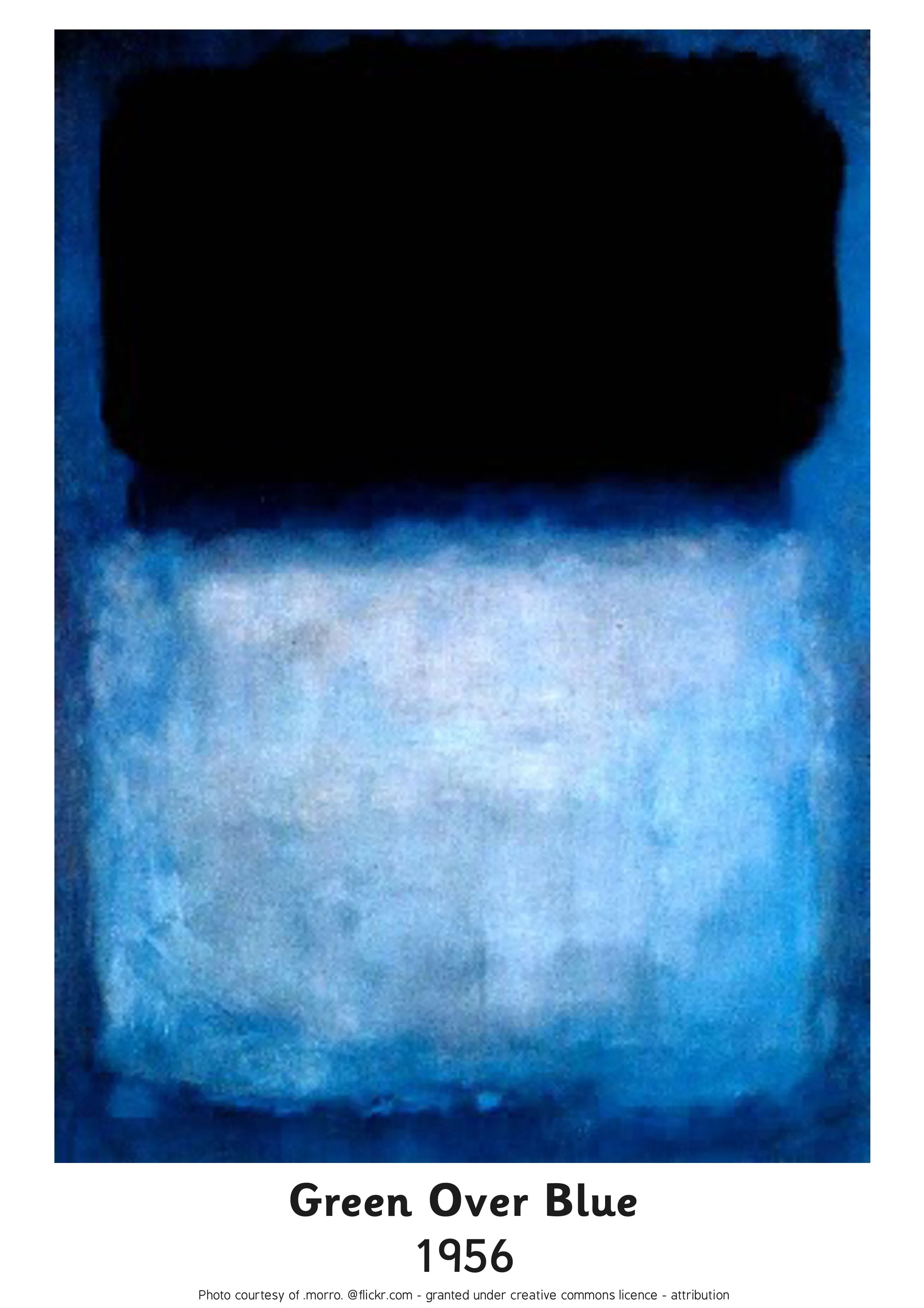
Tragically Mark Rothko suicided in 1970, having suffered an aortic aneurysm and long-term melancholia, exacerbated by the collapse of his marriage the previous year. Glimcher, who curated the exhibition, ‘Rothko: Dark Palette’ in NYC in 2016, feels however that Rothko’s ‘dark phase’ two decades before his death, needs to be re-evaluated. His explanation is that Rothko saw painting as ‘A positive, exulting experience and in fact was unable to paint when he was depressed’ and thus Rothko’s use of dark tones was not necessarily conveying the personal but the universal – the existential quality of being human.
Brett Gorvy, chairman of postwar and contemporary art at Christie’s believes great Rothko paintings have ‘an inner light to the darkness’. In this sense Rothko remains an artist for our times, for him, trying to recover from the trauma of post WW II; and for our present generation, those who yearn for light beyond the horrors of war and genocide.
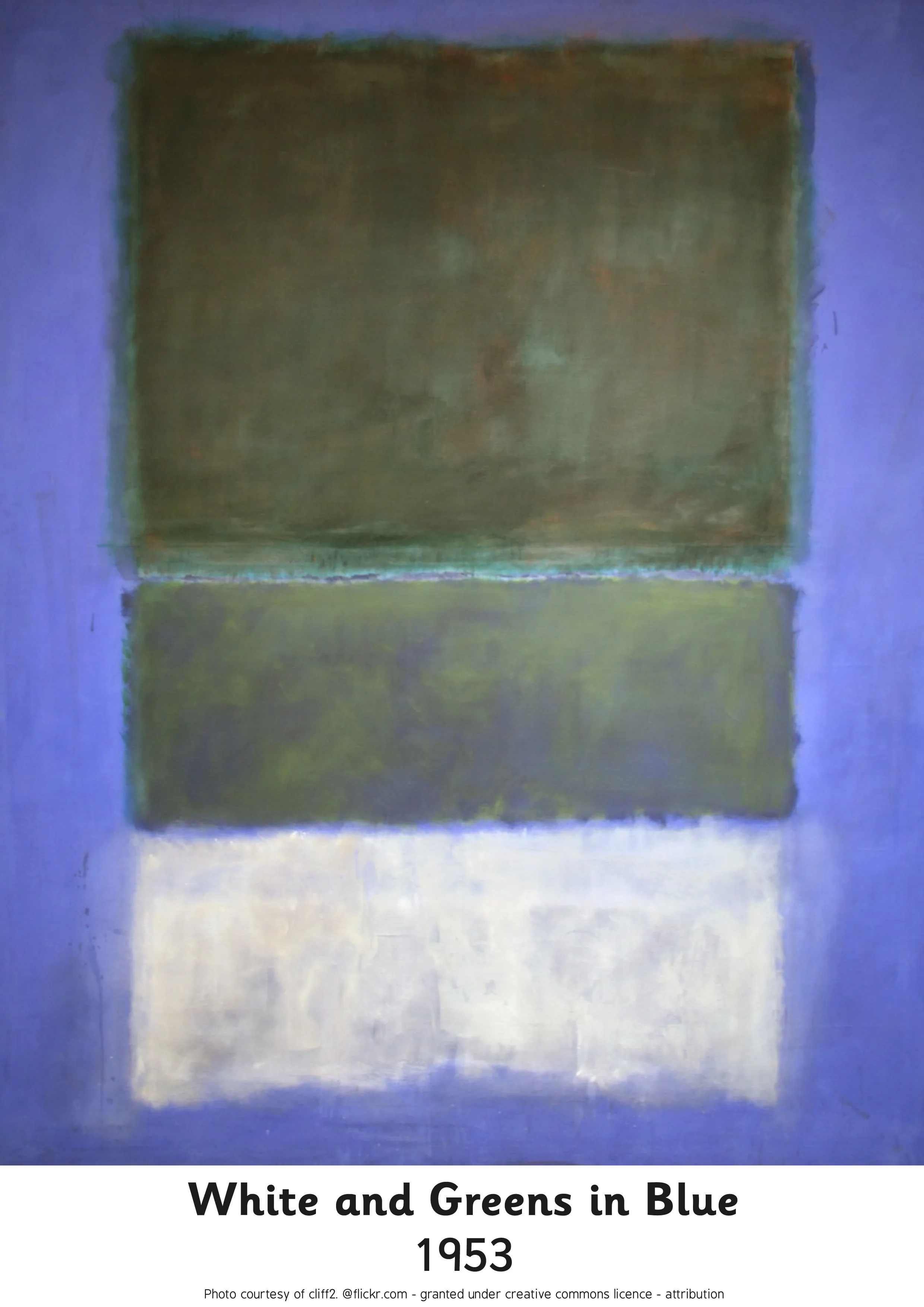
To postulate that every artist who uses bright colours is expressing a happy inner world is to appreciate art at a superficial, perhaps even simplistic level. A better understanding of an artist’s colour choice is to wonder about the inner and outer world of the artist whilst creating the artwork and their various influences - social milieu, political affiliations and spirituality, with the latter having the greatest impact on Rothko.
If we look at primitive rock art and even contemporary art of certain indigenous communities, for example, the artists from Warmun (Turkey Creek), in the Kimberley region, their distinctive colour choice is based largely on what natural pigments are available; their earthy tones coming from natural ochres secured on their sacred land, then become their medium to create with.
Hector Jandany 1929 - 2006, ‘Mother Dreaming’, 1992, Warmun (Turkey Creek). Private Collection.
This is unlike many modern-day indigenous artists who have embraced acrylic paint with all its bright and often dazzling colours. Like the Impressionist painters before them, their artworks exude an extraordinary quality of light. The Impressionists revolutionised art with their singular intent ‘to capture light’, by trying to encapsulate this shimmering, unstable, phosphorescence onto a solid canvas. In doing so, colour became the greater focus over line and form, initiating a whole new art movement.
Wawiriya Burton’s ‘Ngayuku Ngura (My Country)’, 2017, seen below, emanates such light. This painting’s story describes her father’s country near Pipalyatjara, in South Australia, where the mingkiri, ‘small desert rats’ are pregnant. After delivering their tiny babies they search for food and water, their journey through the desert is depicted by the dotted lines. This is the story given to the uninitiated. The encrypted story protects the sanctity of the traditional owners who own this land, which holds the soul of the Amata community. To stand before a great artwork like Wawirya’s below, is to experience a visceral connection that animates at a level beyond materiality.
Wawiriya Burton, Ngayuku Ngura, 2017
Post Impressionism and Expressionism emerged next as a way to explore the inner world of emotion until Cubism appeared, once again re-emphasising the importance of form.
Wassily Kandinsky from his Early Expressionist days to his Abstraction period explored how colour holds specific vibrations that are directly connected to shapes and musical notes. As extraordinary as this may have appeared at the time and still is for many today, this belief is very resonant with the Yogic Chakra System, which appeared in the Vedic texts from 1500 to 500 BC.
Wassily Kandinsky, ‘Jeune, Bleu, Rouge’, 1925 Source: Rawpixel
The chakras are seen as being 7 separate spinning vortices of energy occurring along the spine from the base to the crown, with each chakra having an individual colour frequency from the light spectrum, that resonates when in balance to a specific sound and geometric shape, called yantras.
Understanding the colours of the chakras and the psychological, physiological and spiritual meanings of each of these chakras can be a unique way of understanding why an artist chooses, often unconsciously, a certain colour. Colour in this system is not based on colours being ‘happy’ or ‘melancholic’ but align more with colour as Rothko intuitively experienced it. For him, dark colours were like entering the void to discover spiritual and universal truths. The 6th Chakra at the eyebrow centre is deep Indigo and it is here where we can enter the void. For the many who have embarked on meditation, some have encountered this great abyss and amongst those, many have recoiled from entering this ‘darkness’. For to enter fully without fear is to experience a mini-death, for the realizations that emerge replace everything that was previously understood.
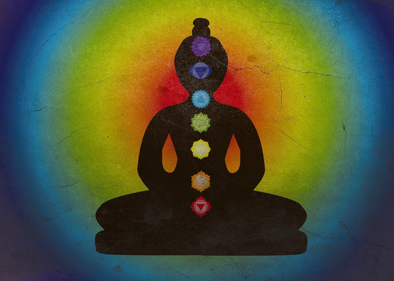
The 7 Main Chakras. with Yantras. Source Alexanfra Koch from Pixabay
At this level of experience, 3rd dimensional reality is neither convincing nor satisfying in and of itself and this leaves everything up for questioning – a frightening place for the ego mind that enjoys the status quo. Yet for the spiritual warrior, who embraces the unknown rather than resisting it, discovering this new way of ‘seeing’ can indeed ignite a level of awakening where it is impossible to turn back.
I would postulate that many artists whether consciously or not, through the exploration of colour and sound have intuitively awakened to this sate, where shifts in perception are felt directly, beyond what institutions and the media would have us believe. This is the alchemy that great artists and musicians offer the world through their artworks and music, allowing their audience to be transported beyond the confines of an everyday ‘materialist’ existence.
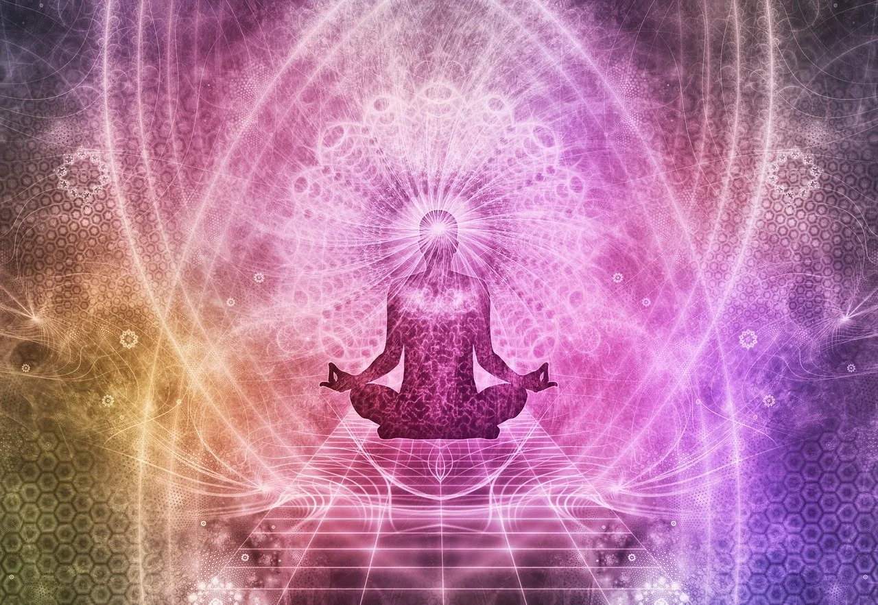
This transcendental state when seen through the chakra system occurs at the crown, the 7th chakra, as we emerge from the ‘dark’ void of the 6th chakra into violet light that can flash as brilliant white. This is where our union with the numinous connects us to that which may be named ‘the Divine, Spirit, the Tao, Source or God’. Curiously before we reach this stage, we have had to travel through the dark indigo void of the 6th chakra. Because it is here that our individual small self has to dissolve, enabling us to discover the eternal reality that we are not alone but forever connected to the greater reality of being one with Source, experienced at the 7th chakra.
Quantum physicists have named this 7th chakra connection as accessing the ‘The Quantum Field’ from which everything is derived and where the observer and the observed interrelate and impact each other. This reality is often described as a direct experience of ‘God’, where belief turns into knowledge. The shadow side of the 6th chakra is delusional thinking, expressed by those who are gripped with 'spiritual superiority', with its strongest expression being a 'Messiah Complex'. The path to reaching the divine at the 7th chakra is one of humble surrender. Thus many a great artist, having surrendered, becomes the conduit for divine genius to flow through.
The Crown Chakra. Source: Image by Okan Caliskan from Pixabay
When Rothko replied to the woman who wanted him to paint her a happy painting by choosing warm colours, ‘But these are the colours of the inferno’, he was speaking his truth. Red is the colour of our base Chakra – here we are connected to our tribe – our immediate birth family. It is where we derive ideally our sense of security. In our 3rd dimensional world, this is translated into our relationship with money, its abundance or lack thereof, and the apparent health of our familial relations.
The Sacral chakra above the Base chakra is orange and is connected to movement, our sexuality and sensuality. When in balance life flows in our intimate relations and creative pursuits, as does our body. The 3rd Chakra at the Solar Plexus is the colour yellow. In balance we experience self-empowerment and autonomy and when out of balance we may seek to have control over others, as the victimizer, or inversely, feel victimized.
The ‘inferno’ Rothko referred to with the colours of red, orange and yellow, could well be the heated and destructive emotions that erupt when the drive for ‘money, sex and power’ dominates all else. Alternatively, if there is resistance to using red, orange or yellow this can indicate that we are resisting taking on the the qualities that these chakras represent. For example, avoiding red may indicate not being sufficiently grounded in reality to adequately provide for one's survival needs. Avoiding orange, which symbolizes movement, could show up as feeling stuck in our work and intimate relationships and thus failing to take action to improve things. It could also manifest as feeling stuck in our bodies where our movement is impeded. A resistance to yellow could express power issues, either not standing up for oneself when being exploited. Thus with poor boundaries we can become a doormat, meeting the needs of others to the cost to our own health.
At our centre lies the heart chakra, the colour green, where we experience personal love towards others and ourselves and in its absence, grief and sorrow. The wise say love will temper the lower chakras bringing them into alignment. Most texts that concentrate on the 7 chakras exclude the upper heart charkra, at the thymus, which is the colour pink, and connected to Universal Love, rather than personal love. I wonder if pink will grow in its significance as a colour expressed in art, as the need for greater loving compassion indiscriminate of race or creed, becomes critical if we are to heal the deep, raw wounds wrought from the terror of our present day national conflicts.
Above the heart chakra, the colour of sky blue, is our throat chakra, the centre of our communication – the source of language and sound and where creative manifestation occurs. This is where we express our truth. A blocked 5th chakra invariably produces uninspiring art, but one that is balanced is capable of brilliance.
I like to use this chakra colour prism for self-analysis and ask, for example when I am using a lot of blue when painting, ‘What within me needs to be communicated now, either to myself or others?’. When using green I ask, ‘Am I needing to express more love or am I celebrating the love in my life?’ When teaching, I am aware that I often choose to wear blue, whilst painting, my wardrobe is dominated by green; blue helping me to better communicate with my students and green, enabling a better connection to the creative process without over analysis.
I think it’s no coincidence that the two most abundant colours in nature are ‘blue’ – the sky and water; and ‘green’ - vegetation. Each time we receive the frequency of these colour vibrations, if we consider Kandinsky’s belief - that colour has a ‘soul quality’, we are being invited to have a heart communication with the natural world, essential for the survival of our species and that of planet Earth. Perhaps it is no co-incidence that the era when most workers have been trapped inside drab coloured, artificial buildings away from trees, water and sky, the most damage to our global environment has occurred. When we look at war torn wastelands, on a visceral level the absence of colour ignites our sense of dread – for colour animates life.

Source: Siala from Pixabay
But what of those colours beyond the spectrum of light? The chakra system recognises that white is the reflective quality of all colours combined and thus emits the most light. This may well explain why Impressionist and Post Impressionist artists interested in conveying light used the full rainbow spectrum – violet, indigo, blue, green, yellow, orange and red mixed with a generous quantity of white. White too is the colour of light and illumination at the Crown chakra. One of the aspects of the Crown chakra is here we engage with the numinous and enter a relationship with the Divine.
The luminosity of Impressionist and Post-Impressionist artworks, the latter emphasizing emotion over realism, have the capacity to draw us in and connect us to everyday life scenarios - a sunlit field, a cloudy sky, a bowl of fruit. The awe felt in these moments of quiet reflection can then be transposed to the ordinariness of own existence. With this comes the realization that the everyday is something to cherish and is enough in itself. Cleaving to a future to find fulfillment can fall away.
Claude Monet, ‘White Frost, Sunrise’, 1889 Source: Public Domain, Rawpixel.
The earthy colours - browns and olives, actually belong to the secondary chakras found at our knees and feet. So, if you are drawn to such earthy colours there may be a need to become more grounded or being grounded is perhaps your happy place. Being grounded is also an aspect of red at the base chakra.
You may wonder how we can be certain of chakra energy centres emitting colour frequencies. Einstein conveyed that matter is really condensed energy and that the electrons within matter, when returning to lower energy levels, release extra energy that is emitted as light. Given this, there's logic that we humans, along with every living entity, also emit light frequencies expressed as spectrum colours, despite being invisible to the naked eye. Isaac Newton, recognized for discovering the Light Spectrum when testing light, which resulted in the first colour wheel, would have been completely unaware that the ancient Indian Rishis, thousands of years before him, through deep meditation had developed an ‘inner eye’ to directly experience this light spectrum. This ability had them see the light spectrum within the human energy centres along the spine and surrounding the physical body, known as 'the human aura'. Although still in its infancy, these ancient revelations are gaining the attention of certain scientists.
Russian husband and wife, Semyon and Valentina Kirlian, were scientists interested in light spectrum phenomenon and invented the Kirlian camera to try and record the human aura, reporting their results in 1958, which then garnered interest in the west from the 1970’s onwards. There is still no definitive consensus as to the accuracy of Kirlian photography and for those looking for scietific proof may remain sceptical, but as science is an ever evolving 'art', future advancements in technology could produce a camera that is unerring in its measurements. As the colours expressed through the human aura directly relate to the balance within your individual 7 chakras in any moment, the aura is not fixed but ever changing. Thus a single aura image can only detect your energy emissions at that point in time.
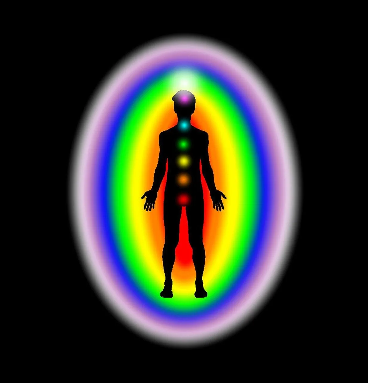
The Human Aura and the Chakra System. Source:Kari Hensler from Pixabay.
If the idea of capturing your aura intrigues you, during the ‘Kandinsky Exhibition’ at the Art Gallery Of NSW, in Sydney, that began this week, Nov 4, the ‘Colour Fields’ workshop invited people to join, one-on-one with artist, Kate Mitchell, to gain their ‘Aura Portrait’ via an analogue aura camera, and then have it interpreted. If you are interested in Kandinsky then do get along to the exhibit or discover the event here: https://www.artgallery.nsw.gov.au/whats-on/exhibitions/kandinsky/
Seeing colour through the lens of the chakra colour system can help us better understand our own or other artists' colour palette choices, by illuminating the psychological, spiritual and physical realities underpinning our decisions to either use or avoid certain colours. The obvious warm/cool colour paradigm for expressing either happiness or sadness can be replaced by a richer interpretation of colours that the chakras provide. Black too can be seen as an invitation into the void as opposed to symbolizing despair. Artists and non-artists alike are invited to become curious about colour and realise what Josef Albers understood that 'colour is the most relative medium in art'.
© Belinda Nolan, 2023.
REFERENCES
Cohen, A. 2019 ‘How Mark Rothko Unlocked the Emotional Power of Colour’, 26 Jun. Available at:
Gibson, P. 2015 ‘The Mystical Stillness of Marina Abramovic in Sydney’, The Conversation, 25 Jun. Available at:
Invaluable, 2022, ‘Picasso’s Periods – A Timeline’, 9 Jul. Available at:
Macasev, A. 2023, ‘Art…Why That Colour?’. Available at:
MFAH, 2015, ‘Major Rothko Retrospective opens at the MFAH September 20', Available at:
, 2023, Public Images for Artists, Available at:
Sheets, H. 2016 "Mark Rothko's Dark Palette Illuminated', Available at: https://www.nytimes.com/2016/13/03/arts/design/maek-rothkos-dark-palette-illuminated.html
Wikipedia, ‘Kirlian Photography’, 4 Nov, 2023 Available at: